Role
UX Strategy, Visual Design, Front-End-Development
Theresas Artwork
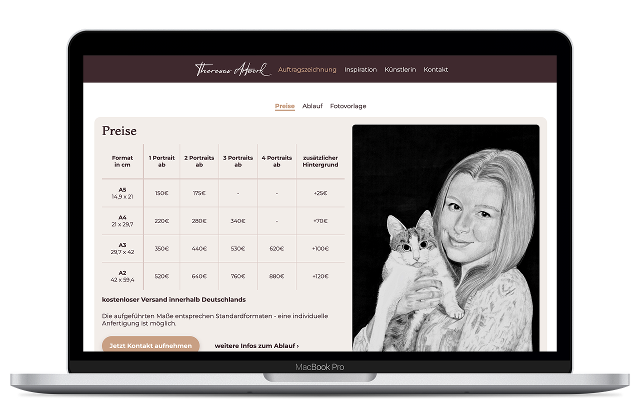
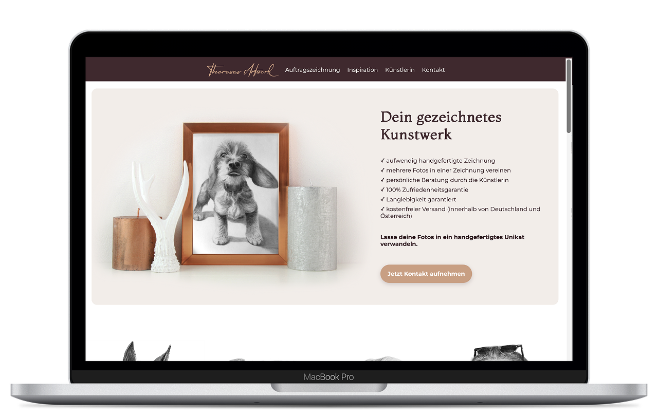
When commissioned artwork became more than a hobby, I needed a way to showcase my work professionally and simplify the process for potential customers. The goal was to create a website that reflected the personality of the brand while making it easy to explore artwork, understand the commission process, and get in touch.
UX Strategy, Visual Design, Front-End-Development
2 months
Independent project
Art & E-Commerce
Commissioning artwork is a highly personal experience. Visitors aren't simply buying a product - they're trusting someone to create something meaningful for them.
The website therefore had to answer three key questions quickly:
Balancing creativity with clarity became the central design challenge.
Although this wasn't a formal UX research project, conversations with customers revealed recurring needs.
These observations became the basis for the website structure.
Keep navigation intuitive and reduce friction.
Reflect the handmade and authentic nature of the artwork.
Ensure a responsive experience across devices.
Reduce distractions so visitors can fully immerse themselves in the artwork and key information.
Use real images, customer work, and transparent information.
Maintain a cohesive visual and functional experience across all touchpoints.
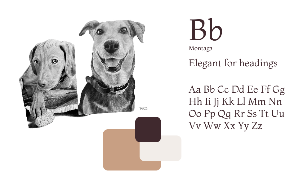
Before designing the website, I created a moodboard to establish a clear visual direction. Inspired by natural textures, soft neutral tones, and minimalist aesthetics, the goal was to create a calm and inviting atmosphere that reflects the handcrafted nature of the artwork.
Although the visual style feels warm and understated, my creative process is highly structured. This balance between creativity and precision became the foundation for the visual identity and ensured consistency across imagery, colors, typography, and layout.
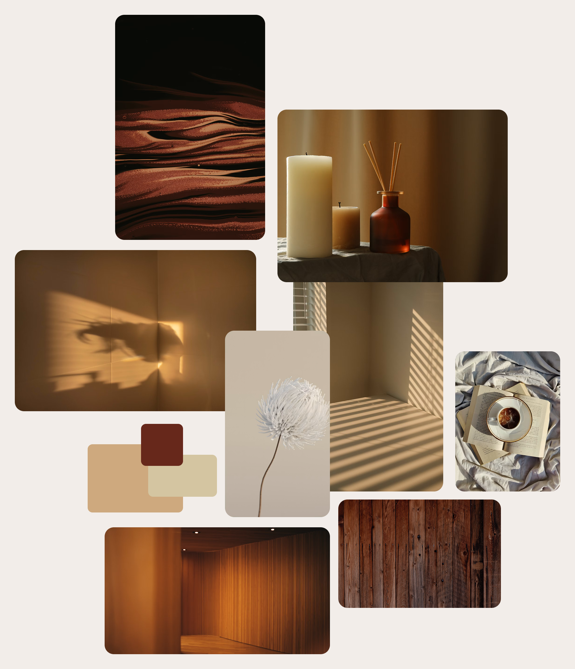
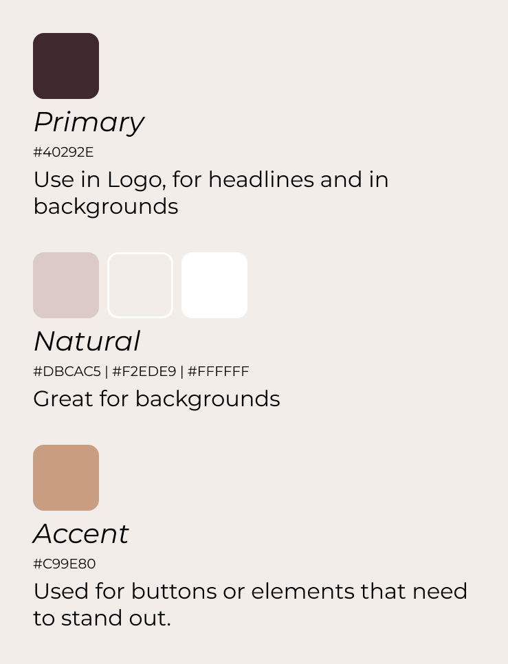
The color palette is built around soft neutrals, warm beige tones, and muted terracotta accents. These colors complement the artwork without competing for attention, allowing the drawings to remain the visual focus.
Each color was intentionally selected and consistently applied throughout the website to create a cohesive and harmonious experience—reflecting the same attention to detail that characterizes my artistic work.
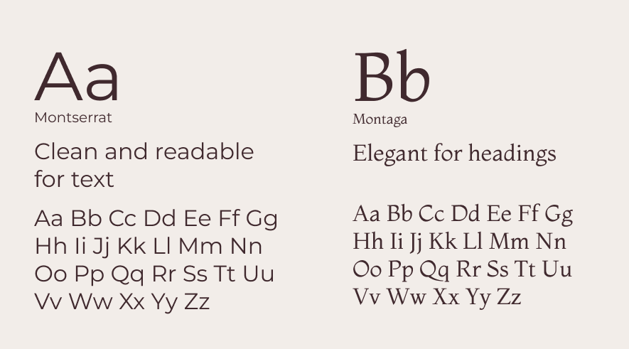
The typography combines an elegant serif typeface for headings with a clean sans-serif font for body text. This pairing reflects the artistic identity of the brand while ensuring content remains easy to read across all devices.
Carefully defined spacing, alignment, and hierarchy create a structured reading experience, mirroring my preference for precision and thoughtful composition.
Creating realistic portraits with charcoal and graphite requires patience, precision, and careful observation. Every line, shade, and proportion is intentional. This same mindset guided the design of the website.
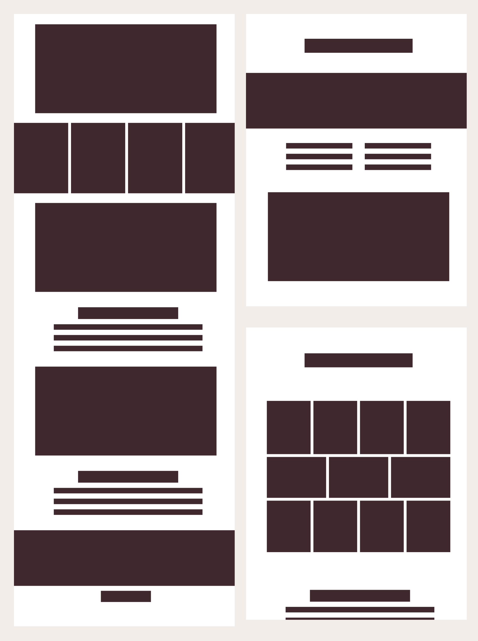
A clear grid system, generous whitespace, consistent alignment, and predictable navigation create a structured experience that lets the artwork take center stage. Rather than competing with the content, the interface provides a calm framework that supports it.
The design principles established the foundation for the project. The following interface decisions demonstrate how these ideas were translated into a consistent, user-centered experience that balances aesthetics, structure, and usability.
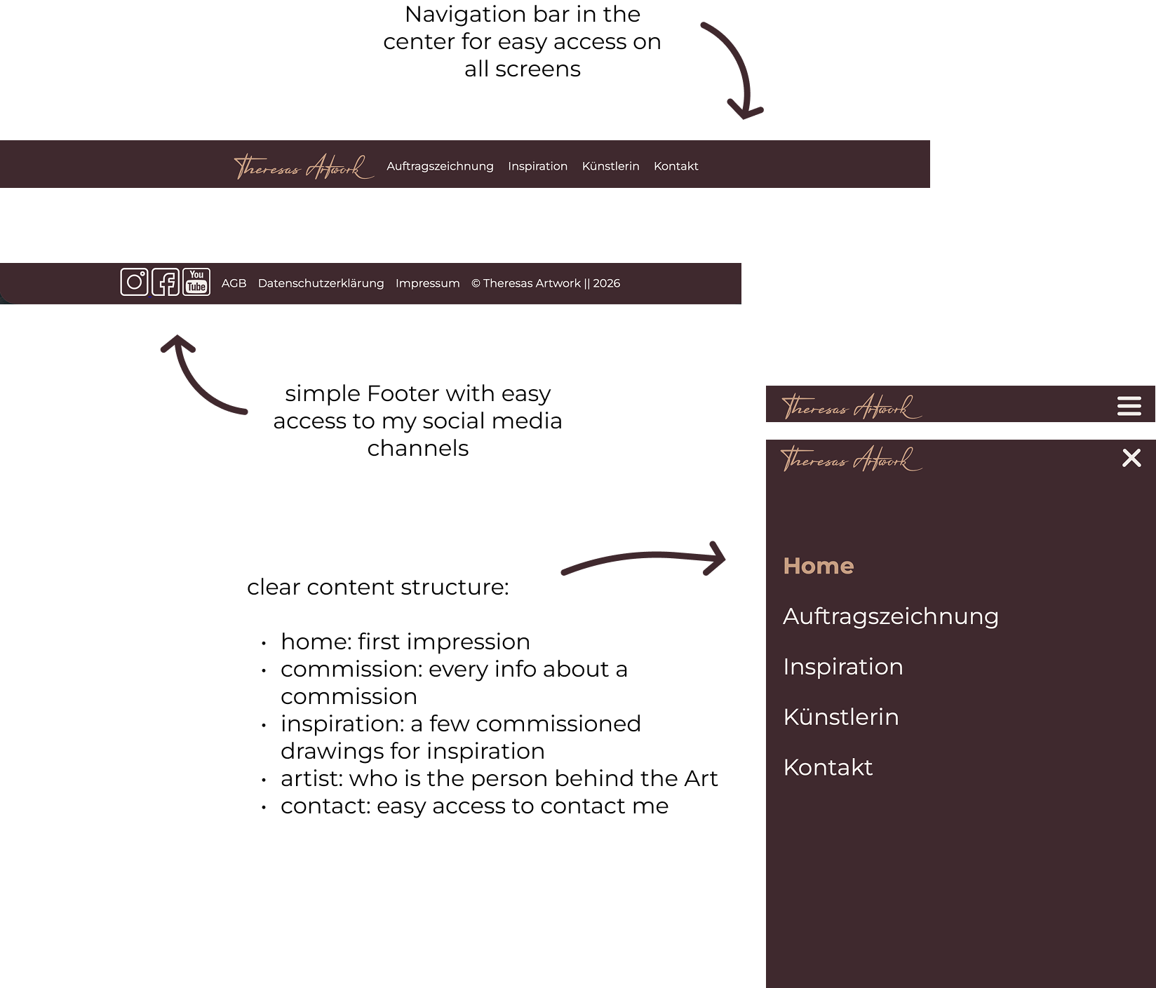
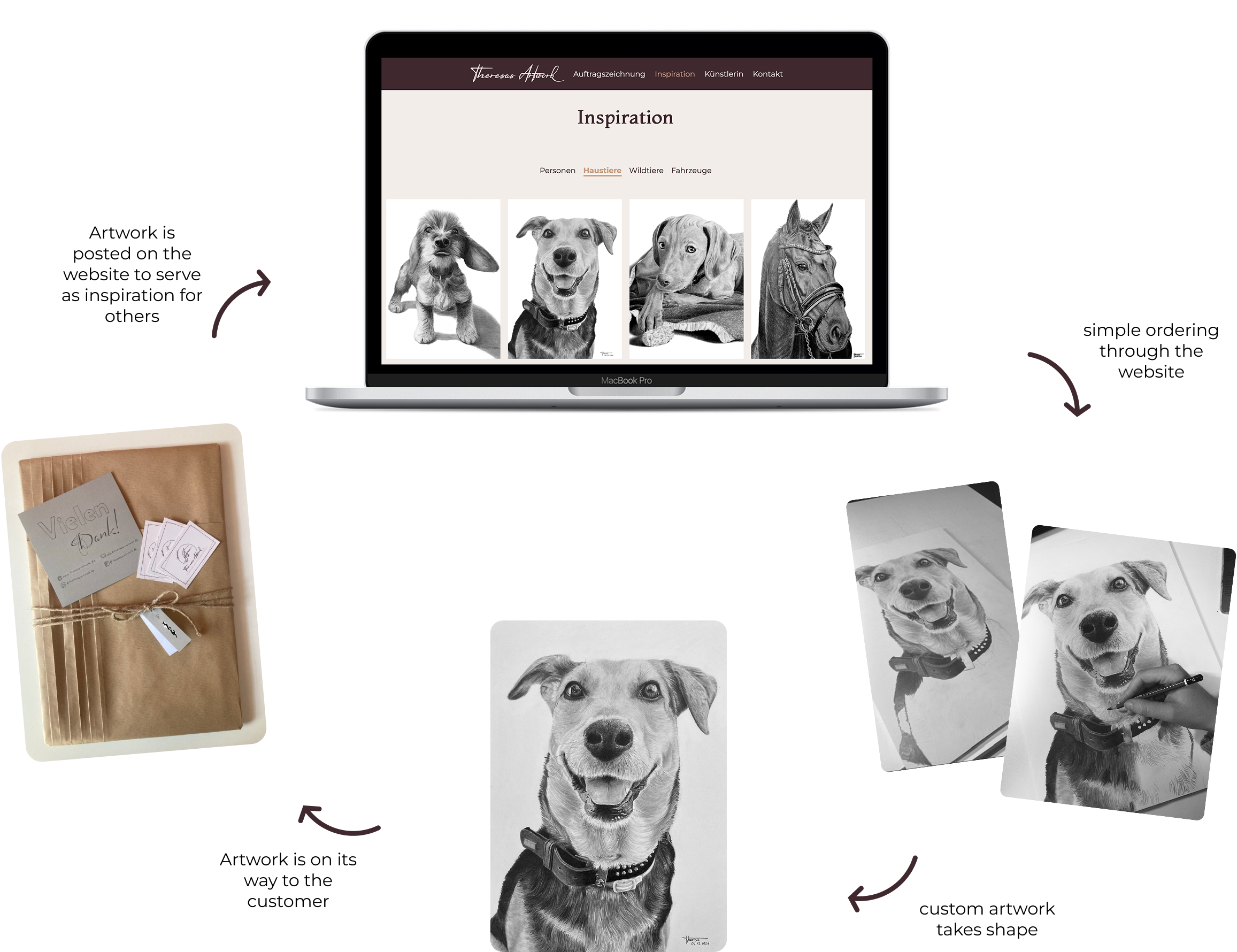
A clean layout, intuitive navigation, and a clear content structure help visitors quickly find the information they need. By reducing unnecessary elements, the website keeps the focus on the artwork and creates an effortless browsing experience.
The visual identity reflects the handcrafted nature of the brand through authentic imagery, warm neutral tones, and elegant typography. Every design decision was made to create a personal and memorable experience that feels true to the artist behind the work.
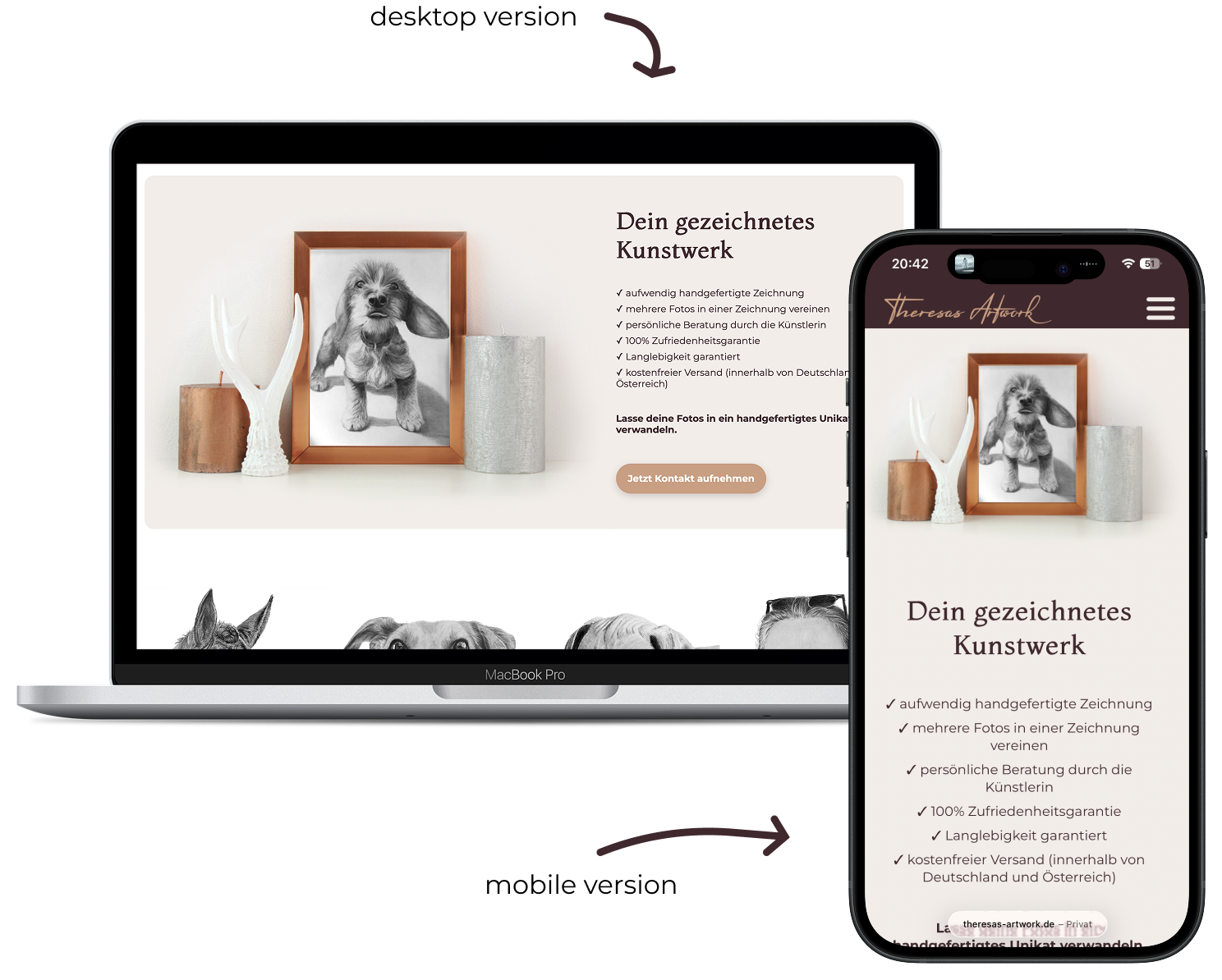
The website was designed to provide a seamless experience across desktop, tablet, and mobile devices. Readable typography, clear visual hierarchy, and responsive layouts ensure that content remains easy to navigate regardless of screen size.
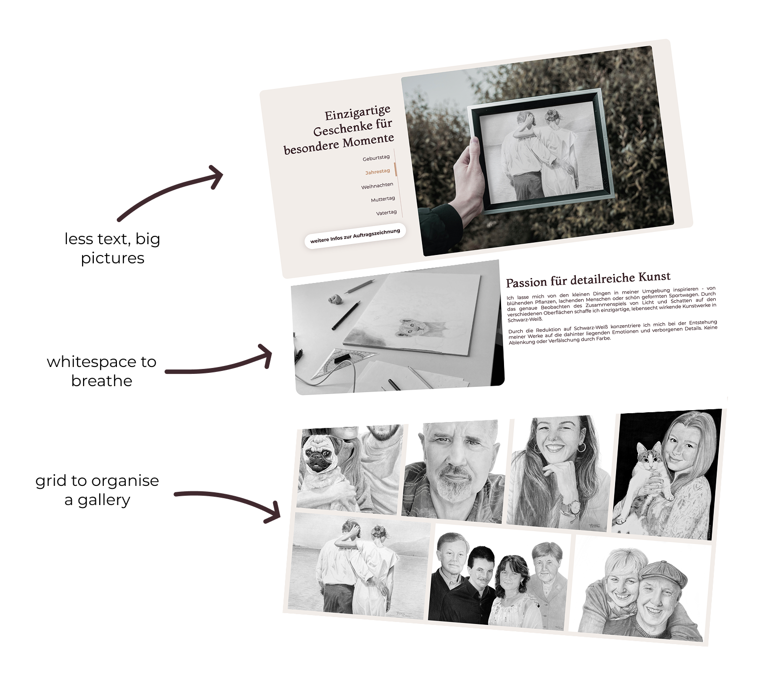
Large, high-quality images and generous whitespace allow the artwork to take center stage. A restrained interface minimizes distractions and naturally guides visitors' attention to the drawings and key information. Grids also help to organize content and maintain visual balance.
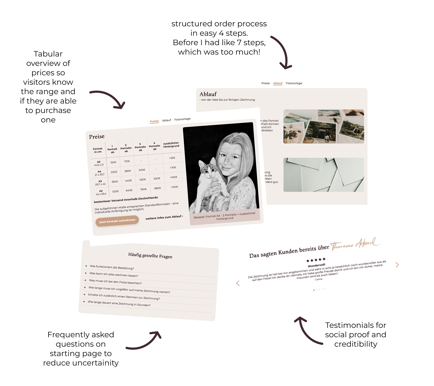
Transparent information about the commission process, customer testimonials, and an FAQ section help visitors feel informed before reaching out. Authentic content and clear communication build confidence throughout the user journey.
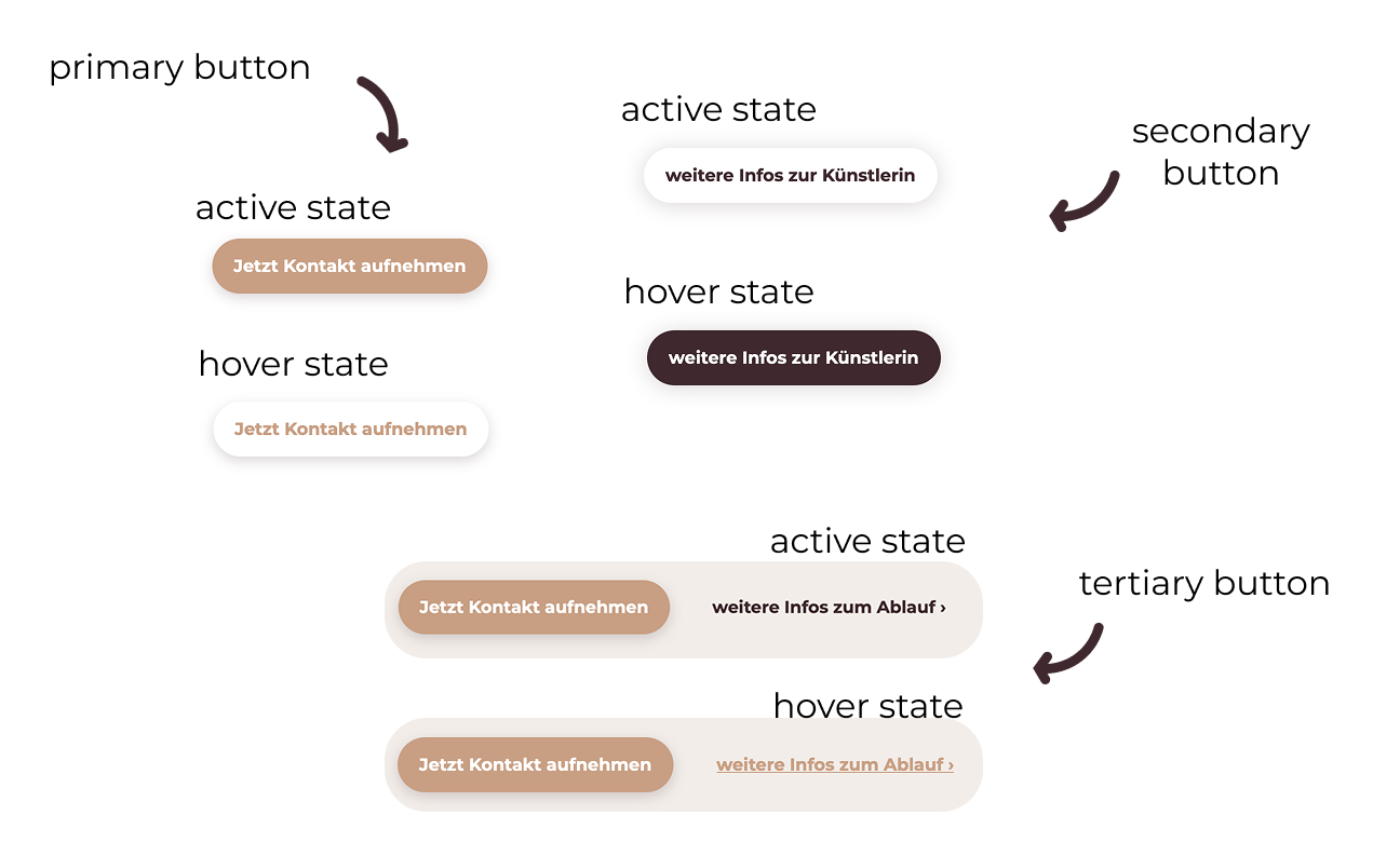
A cohesive visual language is maintained through consistent typography, color usage, spacing, and reusable interface elements. This creates a familiar experience that strengthens the brand identity and improves usability.
Designing Theresas Artwork was about more than creating a visually appealing website. It was about translating a personal business into a clear, trustworthy, and intuitive digital experience.
Whether I'm drawing realistic portraits or designing digital products, I enjoy organizing information, paying attention to details, and creating experiences that feel clear and intentional.
When I started this project, my goal was simply to create a website for my artwork. Looking back, I realize I was solving design problems without yet knowing the language of UX.
Every decision, from the visual identity to the smallest interface details, was guided by the same principles: simplicity, consistency, and authenticity. The result is a website that not only showcases the artwork but also supports users throughout their entire journey.
Looking back, this project revealed a way of thinking that naturally led me toward UX Design.
Theresas Artwork transforms a highly personal, offline service into a clear and trustworthy digital experience: making it easy for visitors to discover the artwork, understand the commission process, and confidently take the first step toward a custom portrait.
My 3 key takeaways from this project are:
This website has become a platform for showcasing my art. It also allows people from farther afield -such as Switzerland, Austria, or France -to discover my art.
Visitors now better understand what I create and how the process is behind if interestet in an own unified artwork.
The website brings together artwork, branding, and storytelling in one cohesive experience.
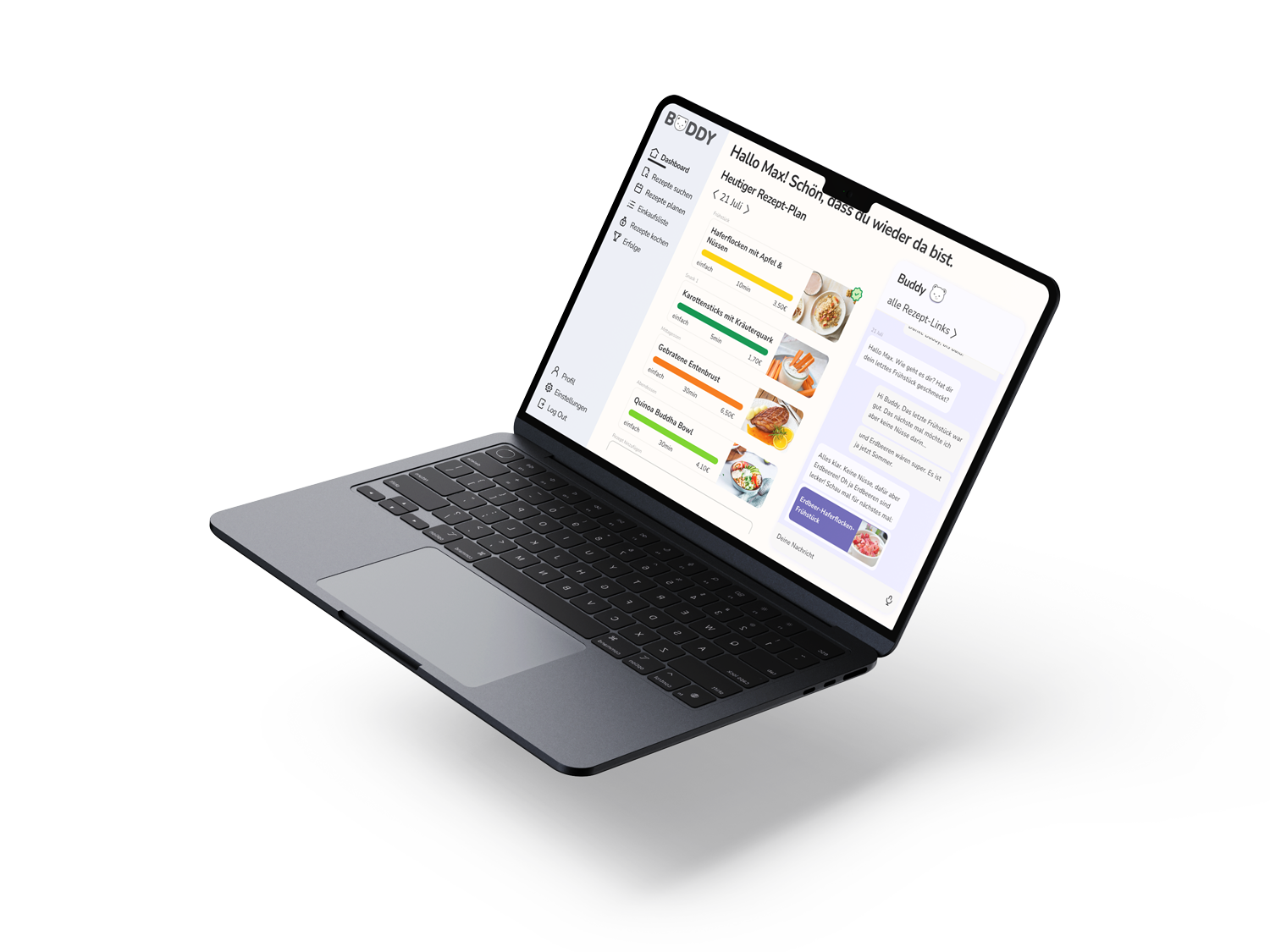
Buddy
Buddy is a user-centered desktop application that transforms research insights into an engaging digital experience. Through iterative design, usability testing and interactive prototyping, the project explored how technology can support healthier daily routines.