Role
Product Designer, UX Researcher, Front-End Developer
Buddy
Buddy is a platform for students to easily find healthy recipes, build a balanced routine and to have a better study time because they are well nourished and healthy.
Unfortunately, the video is only available in German. Sorry!
Product Designer, UX Researcher, Front-End Developer
3 months
Team of two Designers
University Semester Project 2023
Healthy eating often fails before cooking even begins.
Busy students want to eat healthier, but limited time, budget and mental capacity make it difficult to plan meals consistently. Deciding what to eat, finding an affordable recipe and creating a shopping list adds friction to an already busy day.
Our research showed that while breakfast was often planned, lunch and dinner were usually decided spontaneously. This frequently resulted in quick, less healthy food choices.
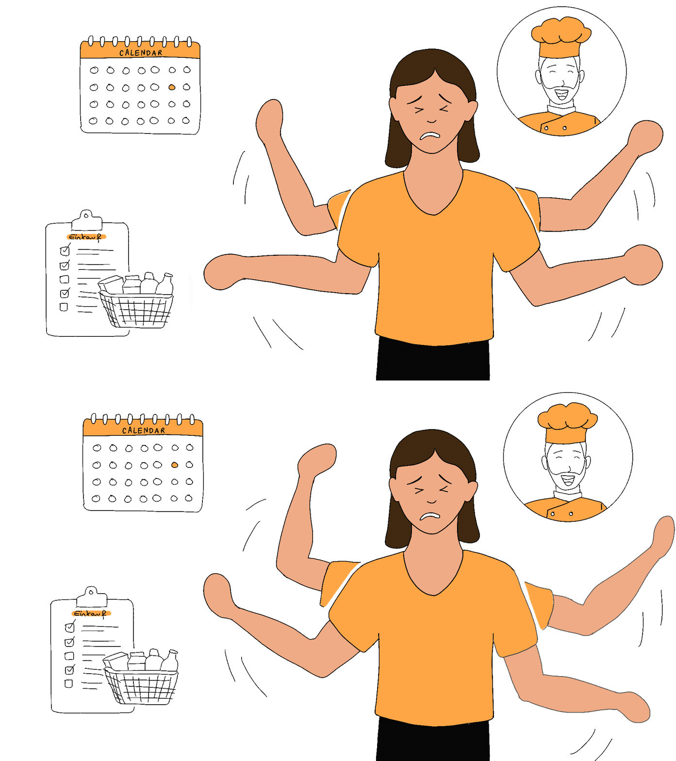
To better understand students’ eating habits, needs, and everyday challenges, we talked to students from our target group and conducted a diary study. This helped us identify recurring patterns around meal planning, time constraints, motivation, and food choices.
Students often don't lack the intention to eat well - they lack the time and structure to decide what to eat ahead of time.
Finding a suitable recipe, considering price and preparation time, and then creating a shopping list turns one meal into several separate tasks.
Students value autonomy. The product therefore needed to support healthier decisions without judging or prescribing what users should eat.
Students need affordable options to make healthier choices sustainable within their limited budgets.
Research Learning: Our initial diary study created too much effort for our time-constrained participants. This taught us that the research method itself needs to respect the behavioral context of the target group.
Buddy combines the fragmented steps of healthy eating into one experience:
For busy students who want to take better care of their health, Buddy is an interactive meal-planning companion that helps them build healthier eating habits in everyday life. Unlike traditional calorie trackers, Buddy focuses on planning meals, improving food choices and staying motivated.
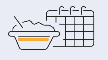
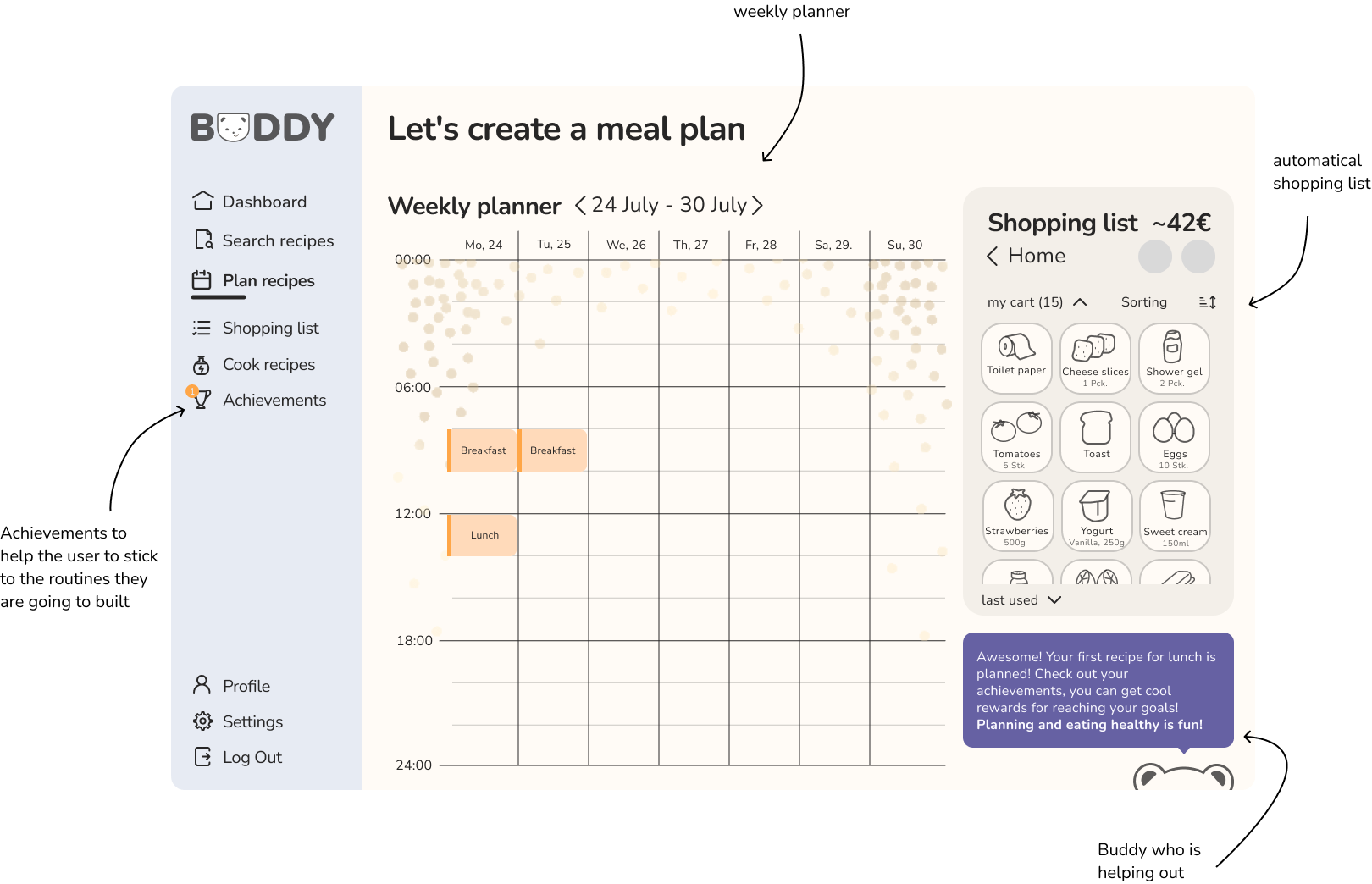
Because meals were often decided spontaneously, we introduced a weekly planner to help students prepare ahead.
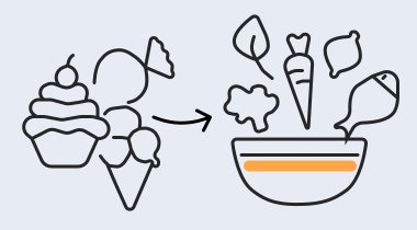
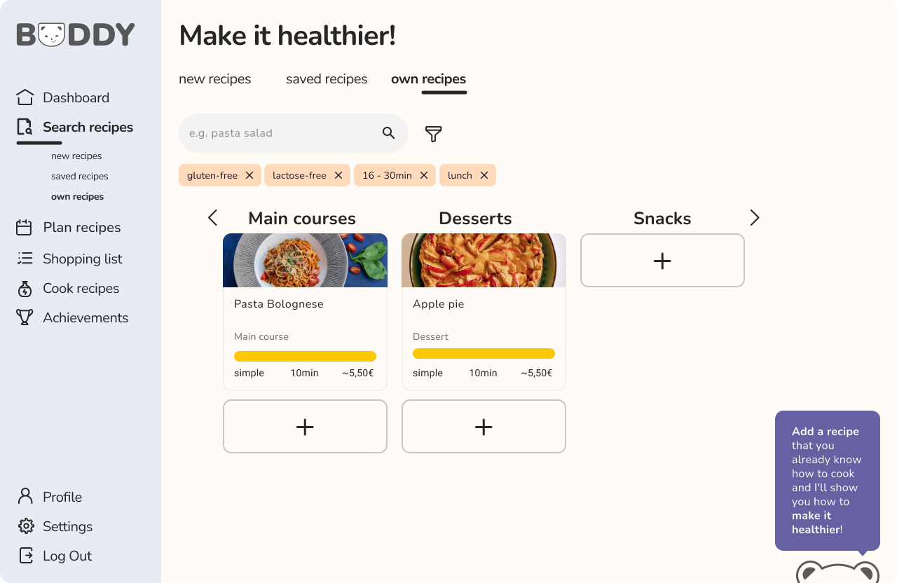
Users can get a healthier version of their own recipe by providing Buddy with an ingredient list and preparation steps.
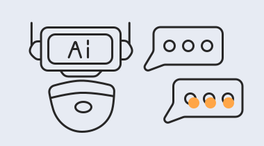
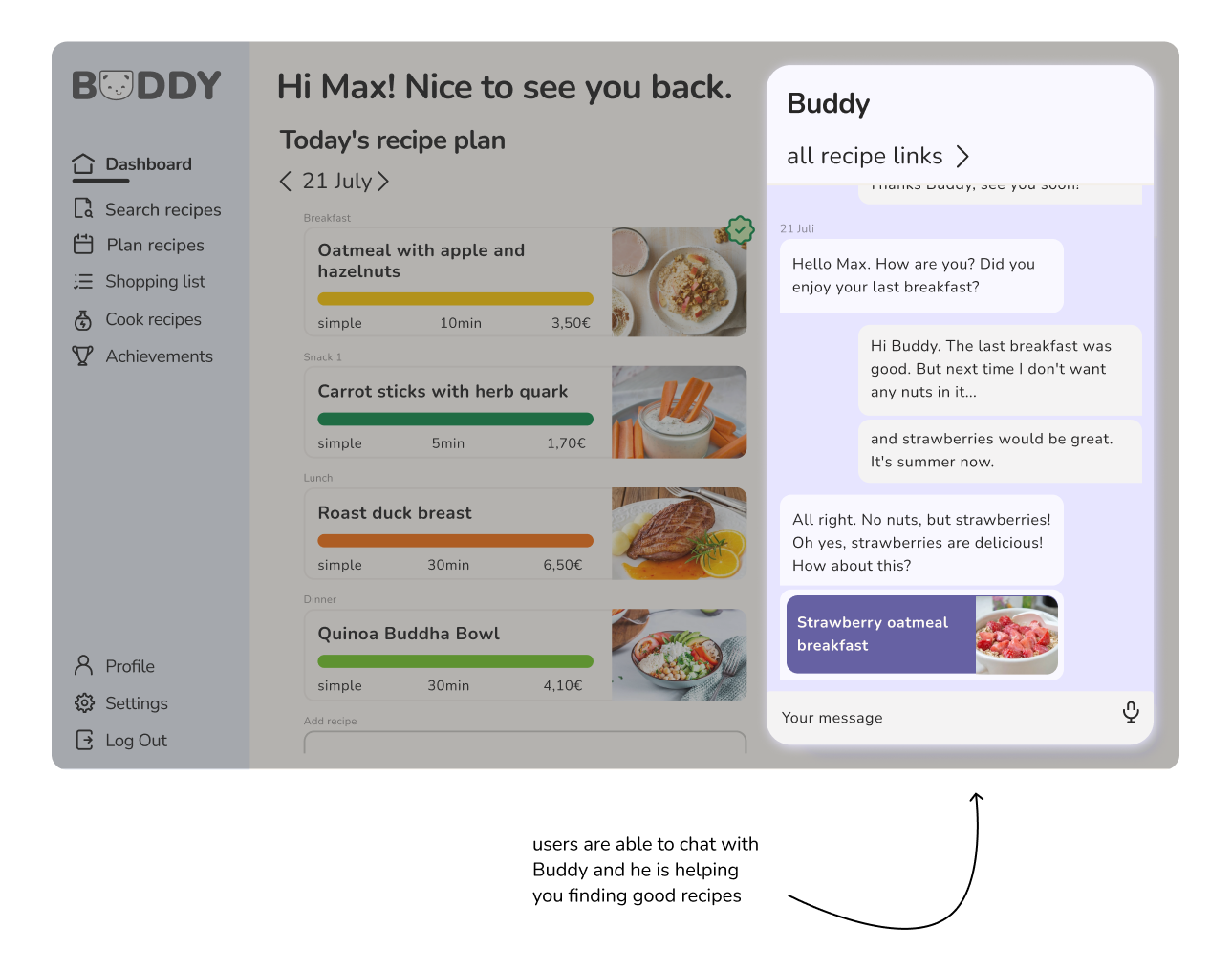
With an AI-controlled chatbot, users can quickly access information about nutrition that is tailored to their needs.
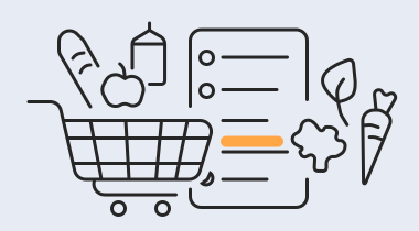
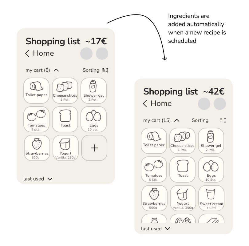
Planned meals translate directly into ingredients, reducing another manual planning step.
Users are encouraged to keep up their healthy journey with a built-in reward system.

Based on our research insights and core features, we created an information architecture and user flows to define how users move through Buddy. Our goal was to connect recipe discovery, meal planning, and grocery shopping into one simple and coherent experience.
We translated the core features into an information architecture that connects recipe discovery, planning, grocery shopping and personal progress.
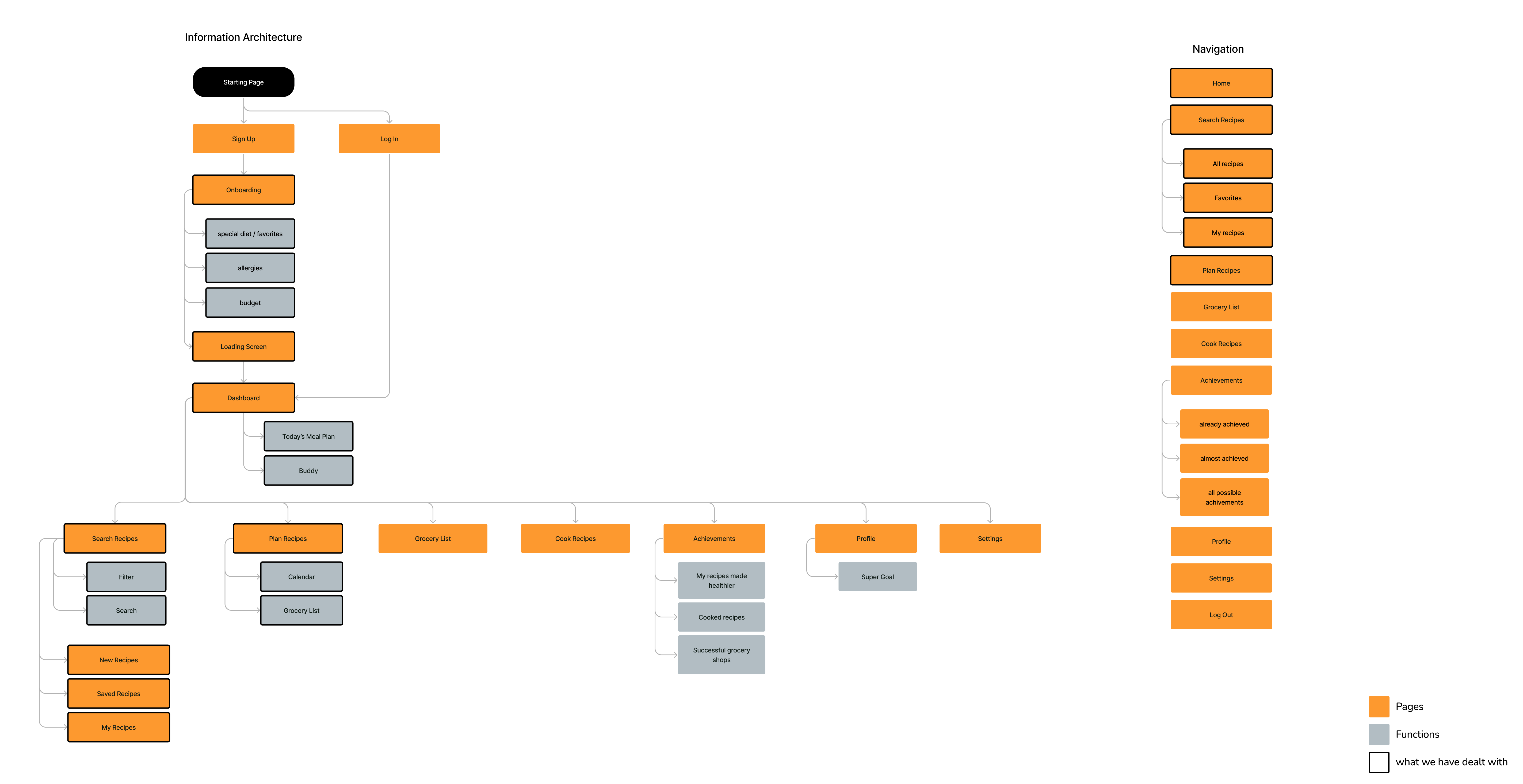
As we had only given a small amount of time for the project, we focused on onboarding and finding and planning recipes. To create a great user experience, we created User Flows to think about each step the user needs to take.
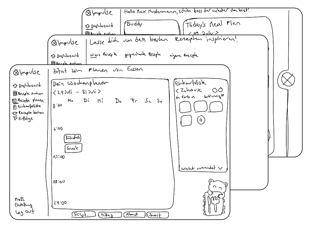
We started with low-fidelity wireframes to explore different layouts and interaction patterns before committing to the visual design.
Buddy should feel like a companion, not an authority.
We designed Buddy to feel friendly, positive and supportive. The assistant provides guidance without judging users for their food choices.
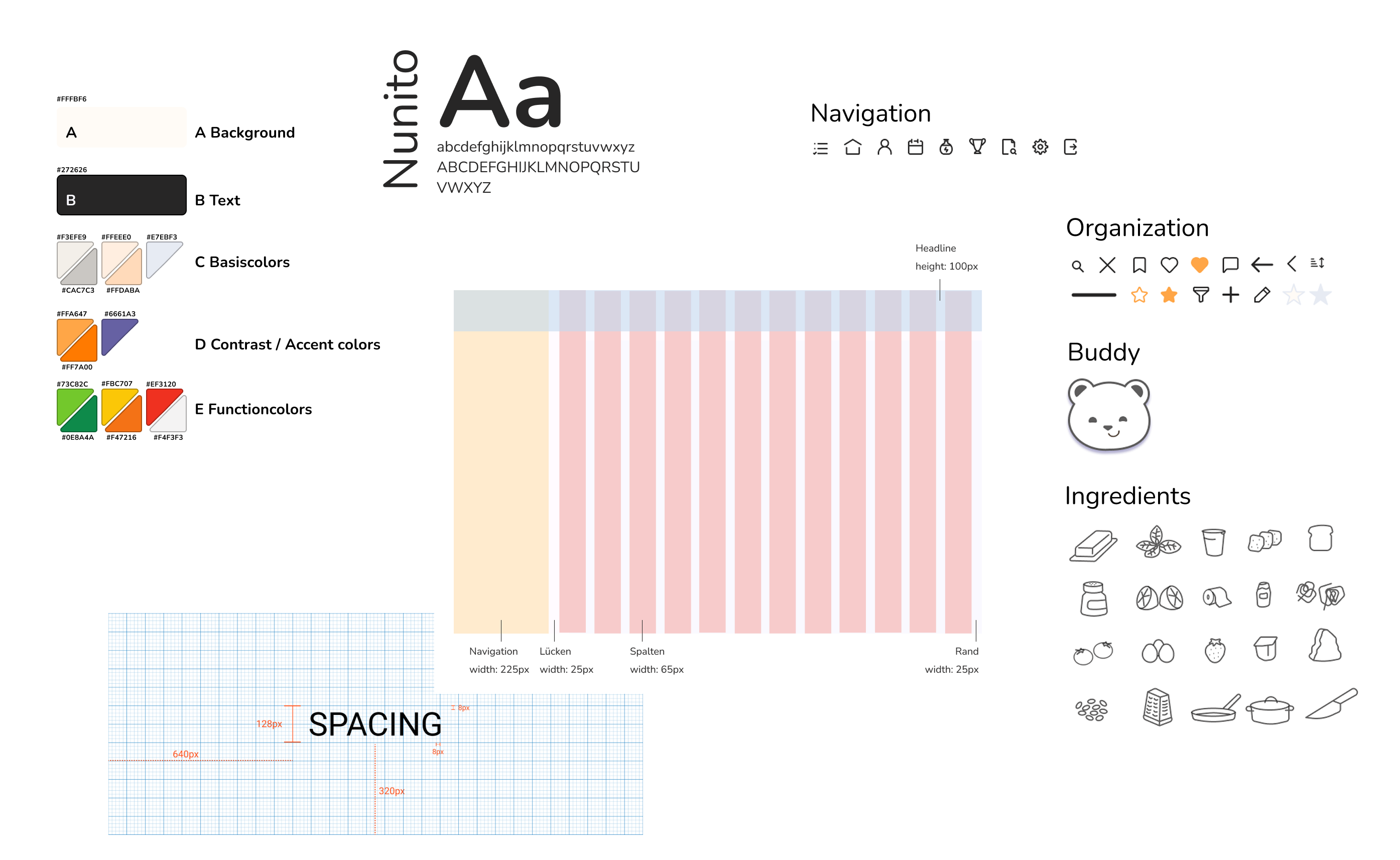
We used warm neutral tones with vibrant orange accents to balance trust and clarity with energy and motivation, while the rounded Nunito typeface reinforces Buddy’s friendly and approachable personality. A consistent icon system keeps navigation intuitive, complemented by custom illustrations for ingredients and Buddy to give the product its own recognizable character.
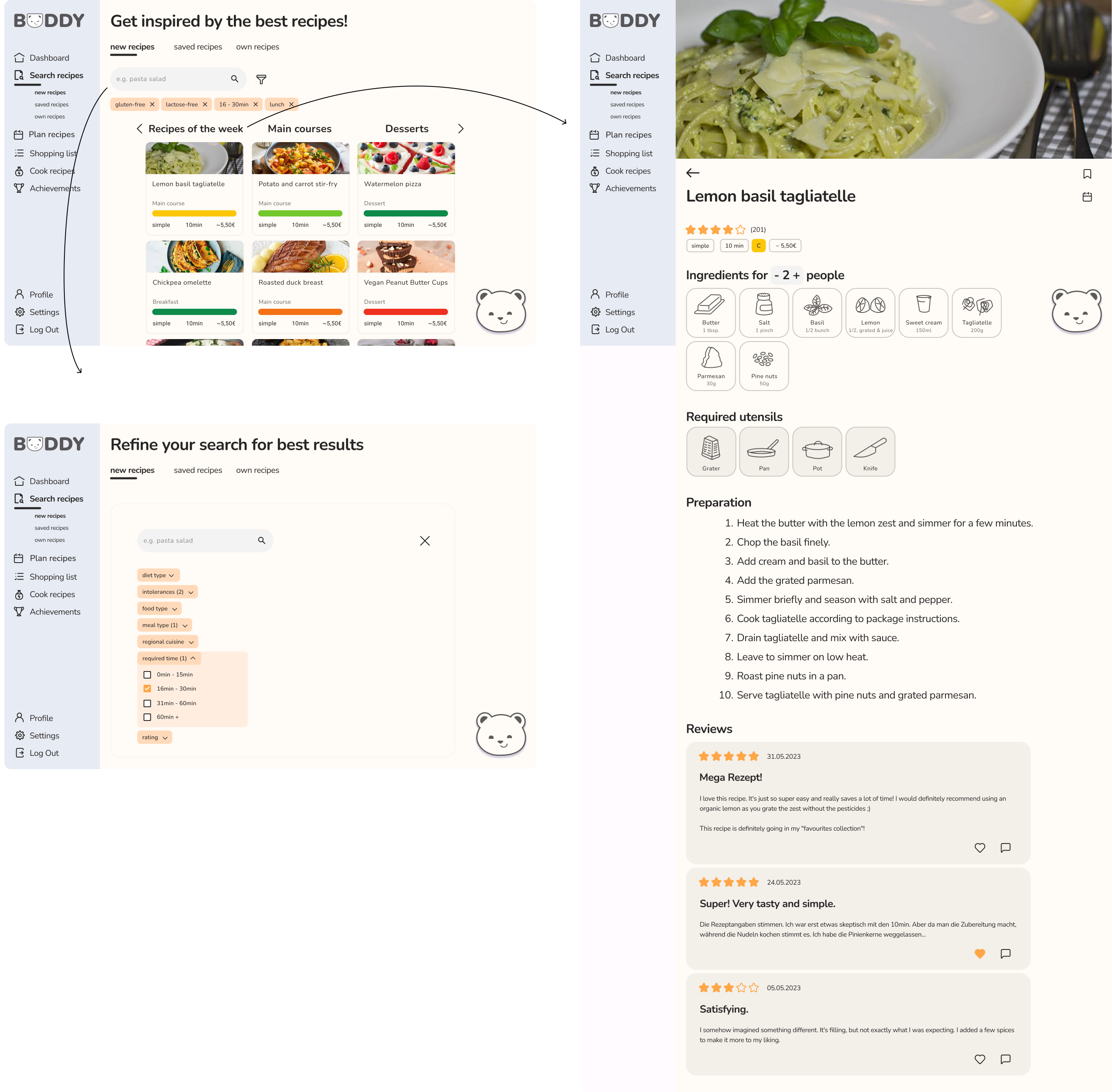
Students can discover recipes based on their preferences and quickly understand preparation time, cost and nutritional quality.
Meals can be added directly to a weekly planner, helping students decide what to eat before busy days get in the way.
Buddy automatically connects planned meals with the ingredients users need, reducing the effort of creating a separate grocery list.
Buddy provides contextual suggestions and encouragement throughout the experience.
“Make it healthier” helps users improve their favorite recipes without giving them up by suggesting healthier alternatives for individual ingredients, making it easier to understand how small changes can lead to more balanced food choices.
 Try it yourself: our interactive prototype in Figma
6 participants · Scenario-based usability testing · Eye tracking
After creating an interactive Figma prototype, we tested key scenarios with six participants to understand whether users could navigate the experience and discover its core functionality.
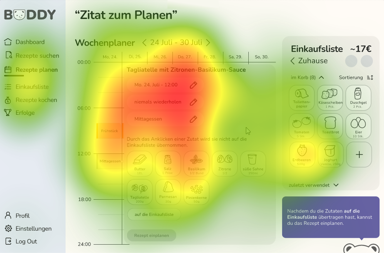
We intentionally designed Buddy to remain subtle and avoid interrupting users. During testing, however, participants frequently overlooked him.
→ Design implication
Increase Buddy's visual presence and use purposeful motion when contextual guidance is available.
Participants struggled to understand where to find the feature. Both its naming and its position within the information architecture created uncertainty.
→ Design implication
Integrate the action more directly into the recipe experience and reconsider its naming.
Eye-tracking showed that users’ attention did not always align with the elements we considered important. The resulting heatmaps helped us identify which interface elements attracted attention and which were easily overlooked.
Due to the semester timeline, these findings could not be implemented in the final prototype. They became recommendations for the next iteration.
Our diary study showed me that research itself creates friction. Asking busy students to document their behavior extensively conflicted with the very problem we were investigating.
Usability testing revealed that design decisions that seemed logical to us — such as keeping Buddy visually subtle — didn't necessarily work for users.
Creating parts of the visual system too late resulted in unnecessary iterations across multiple screens. I learned to establish core design foundations earlier.
Buddy explores how digital products can support healthier eating without turning nutrition into another task to manage. By bringing recipe discovery, meal planning, grocery preparation and supportive guidance into one experience, we designed a concept that helps busy students turn healthy intentions into routines that better fit their everyday lives.
My 3 key takeaways from this project are:
We explored many ideas, from mindfulness exercises to community features, but limited time forced us to prioritize the core problem: eating habits. Learning to say no to features helped us create a more focused product experience.
Translating parts of Buddy from Figma into HTML, SCSS and JavaScript gave me a better understanding of how design decisions affect implementation. It taught me to think beyond the interface and consider technical feasibility earlier in the design process.
Buddy taught me that encouraging healthier behavior is not about giving users more information or more rules. Sometimes the more meaningful design opportunity is to remove everyday barriers and make the desired behavior easier to integrate into existing routines.
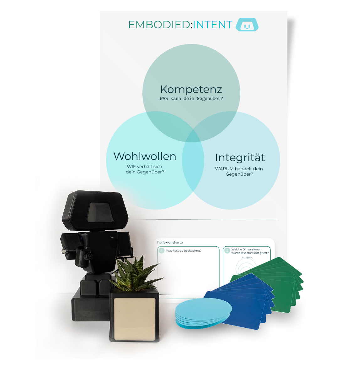
Embodied:Intent
Embodied:Intent is a workshop concept designed to help interdisciplinary product teams understand how design decisions influence trust in digital systems. Through hands-on interaction with a physical robot, participants experience the impact of competence, integrity and benevolence firsthand, enabling more conscious product decisions.